Amalgamation

Two months later and I’m back with another wonky perspective post. This time instead of faking depth, I’m going to remove it. Specifically, I tried my hand at making an anamorphic image of something from 1984 (because I didn’t want a meaningless picture and we read 1984 last year).

Image from here.

According to Wikipedia, anamorphic images are images that must be viewed from a specific position or using a special device in order to see a recognizable image. In my case, I divided an image I found on google into several parts and then resized them.

Here it is.

There are some … big differences.

Logically, it’s not too difficult. As long as the proportions on each part of the same, then the dilation factor doesn’t matter. The difficult part comes from arranging the pieces together in real life. For some anamorphic images, computer programs are used to make a plan for how to arrange the parts, but I didn’t use a computer to make the image aside from cropping and resizing pictures since
1. I don’t know how
and
2. I’m not sure it would’ve helped enough to be worth the extra time.

So at this point, I might as well start talking about what I did and where it all went wrong.

Process

After finding the image I wanted to use, I split it into 11 parts (or a-score-minus-nine parts) and then cropped and resized each part.

This stage is actually where I first messed up because I didn’t measure how much I scaled each image. Generally the rule of thumb is that distance is proportional to size, so if you double the size of something, you should move it twice as far away to make it appear the same size. Here though, I just rounded the length dimension to the nearest 0.5 on PowerPoint so I didn’t know the dilation factor and had to guess all the distances.

The next step was printing all the pieces and then taping them to a more solid surface. I chose to use cardboard since paper is a little too flimsy to ensure a nice picture. Though to be fair, the cardboard wasn’t exactly the easiest to work with either …

Finally came the setting up step. Here’s the tricky part. Since the pieces have to be different distances from each other, most of the easy solutions require suspension of some kind.

At first, I tried hanging all the pieces using red thread tied to some chopsticks, but I quickly ran into some problems.
1. The pieces tend to spin. Maybe this was due to how thin the string I used was, but even the slightest vibrations would send the pieces twirling.
2. The pieces will not be balanced evenly. Same as problem 1, the slightest shift or tug of the string would tilt the piece and ruin the image. Adjusting each piece would just send it careening again, forming an endless loop.
3. Adjustment of height is very difficult. Tying notes for every piece makes it troublesome to move the pieces. This is worst when after you notice a mistake in relative distances since moving a piece closer or farther away from the camera requires a change in height. Also, the process of tying the knot can sometimes move the piece higher or lower than it should be, which truly makes this a trial of patience.

Unable to successfully troubleshoot the problems that took up more time than I had, I ultimately decided to give up.

Viewing the result, I think my discouragement is justified. It took my nearly 2 hours to hang 3 pieces and in the end, they didn’t even match properly.

As I approached Hour 4 of the assembly process, I decided to switch to sticking every piece on a stick and then stabbing the sticks into Styrofoam. Theoretically this method is easier though not as aesthetically pleasing as the Styrofoam and sticks ensured the pieces wouldn’t shift or twirl and made adjustments easy. However in practice, the method came with its own litany of frustrations.

The problem with stabbing sticks into Styrofoam is that after enough stabs, the Styrofoam starts to have pits that make small adjustments almost impossible. On top of this, grooves in the cardboard meant the sticks didn’t stab perpendicularly through the pieces so I had to factor the tilt of the pieces on the sticks and the tilt of the sticks in the Styrofoam when piecing together the image. And remember before how I mentioned working with cardboard isn’t a complete walk in the park? Yea … Somewhere during the cutting process, I must have chopped just enough off the cardboard so that there wasn’t a noticeable difference until I tried to piece all the parts together. The mistakes warped the pieces leading to gaps and overlaps in the final image.

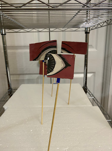
What’s more, my rounding of the dimensions instead of careful calculations resulted in the image being larger than I expected. The biggest piece needed to be farther back than I could stably put it and had to be lower than the Styrofoam base I used. In the end, I chose to just do the top half of the image with the eye.

Of course there are some (read: a lot) of errors, like the gaps between pieces, but if you squint and look from the side, it does look like one single eye. Hopefully? However despite how wonky the final image looks, it looks more like a poorly put-together puzzle than an amalgamation of different pieces at different distances from the camera thus I have (somewhat) successfully accomplished the goal of this project: removing depth from an image.

Bonus

Here’s what the eye looks like from a different vantage point that’s straight in front of the model instead of angled slightly to the bottom left.

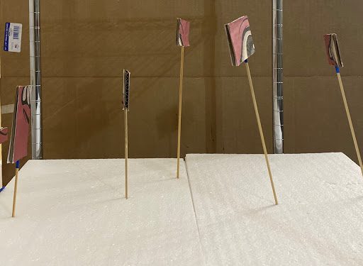
Here’s another image of what the model looks like from the side. You can see the distance between all the pieces and the result of foolishly random dilations. Also please note how tilted each stick is (except for that second left-most one? I don’t know how that happened), a result of too much Styrofoam stabbing and attempts at making the final image look more cohesive.

Do My Eyes Deceive Me?

Yes. Yes your eyes do indeed deceive you. Or rather, the cones in your eyes deceive you. This post is a slight detour from the theme of this blog, from depth perception optical illusions into the realm of color illusions. Specifically, this is going to be about how our eyes can change color from what it actually is to what we perceive it to be.

Color Contrast

You’ve likely seen the phenomenon before since it’s a relatively common optical illusion. Two colors will appear to be slightly different but turn out to be the same because they are on different backgrounds. This is because the cones in our eyes, which perceive color, become less sensitive to the same color after perceiving it. Light blue will look less blue against a dark blue background than against a dark red background.

simultaneous contrast
Image from here.

As you can see in the above picture, though the olive green stripe in the middle appears more green on the left side and more red-brown on the right side, the stripe is actually a uniform color throughout.

Flame Test

To see if I could reproduce this phenomenon (and also for the sake of this entry), I modified my chemistry design lab, a flame test, and tested the effects of different backgrounds on the perceived color of fire. There are several differences between testing color contrast with fire and solid objects that made it difficult for me to know for certain if I would be able to accurately create a color contrast illusion: first, fire isn’t a solid which means any background color that I hold behind it has the possibility to bleed through and change the actual color of the fire; second, fire emits light as opposed to just reflecting it which may or may not have an effect on how we perceive color. I don’t know. I’m not in AP Psychology.

For this experiment, I burned solutions of NaCl dissolved in distilled water. Burning the solution, or rather the sodium ions in the solution, would produce a yellow-orange color. While the flame was burning, I held different colored sheets of paper behind the flame. Here are the results.

From picture to picture, the intensity of the flame appears slightly different against the different backgrounds. Against the black, the yellow is at its brightest and most intense. Against the turquoise background, the flame appears more yellow while against the yellow-orange background, the flame appears darker and duller. However, all flames are actually the same color.

Even now against a predominantly white background, this yellow probably appears slightly different from the flames in the pictures, but (using the eyedropper function in PowerPoint to confirm) all of the yellows are RGB (253, 255, 17).

This was the same test done with a green-blue flame produced by burning copper ions in a copper sulfate pentahydrate solution. The experiment didn’t work as well for this color since it is clear that the colors of the background changed the colors of the flame (the turquoise background of the middle image made the flame appear teal flame while the yellow-orange background of the right image made the flame a yellow-green the color of dying grass).

Bonus

Here’s some more random color illusions to close out this post.

Color Constancy

You may have seen these viral images of colored strawberries created by Akiyoshi Kitaoka. In these images, the strawberries appear to be a completely different color from the background when in actuality, both colors are the same shade.

Image from here.

When you dissect one of the strawberries, it turns out that the strawberries are actually a mix of the color of the background and gray. For example, the image with the blue-washed background and the “red” strawberries turns out to have blue-gray strawberries instead of red ones.

Image from here.

This phenomenon is caused by our brain filling in the gaps in information. Our brains are sort of lazy and we process a lot of information, so often times our brains will try to cheat by filling in the blanks with what we know is supposed to be there. However, the reality is that sometimes the filled-in information isn’t exactly accurate. In this case, when different colors are added to the images, the color of the strawberries appears to be opposite to what they actually are.

Magenta

This is magenta.

Image from here.

This color does not exist. To know why, we need to know that each color on the visible light spectrum has a different wavelength and energy, which mean all real colors that we can perceive can be recreated by knowing its specific wavelength. Except for magenta.

Magenta is special because there is no point on the visible light spectrum that produces the color magenta. There is no wavelength that will give you magenta. Between the purple end and the red end of the spectrum is blue, green, yellow, and orange. Every color except for magenta.

Image from here.

Rather, we see magenta when there is an absence green light.

Here’s some magenta created during the previous flame tests made by mixing LiCl and KCl solutions. Happy non-existing!

Reverse Gravity

Japanese professor Kokichi Sugihara is rather well-known for several utterly mind-breaking optical illusions. I tried to recreate one of his illusions where a marble appears to roll uphill. Here are the results.

It’s a six second long video that I spent three hours trying to make. At least it looks kind of cool.

Process

Though it appears as if the marble is rolling up a slope and going against gravity, that’s not what’s happening. Rather, the angle of the camera and the cuts to the cardboard hide the actual shape of the model.

First, I created a preliminary model to test if I would be able to successfully recreate the illusion in the first place. These are the shapes I used in my attempt. The key part is the arrow-like cardboard cutout. The right side of the arrow is shorter than the left side which allows the shape to look like it’s bent upwards when viewed from an angle. The triangles cut out also help fuel that bent illusion by giving the shape a false sense of depth.

This was the preliminary model when I put all the above pieces together. As you can see, the illusion is partially successful. Though it does look like the cardboard is bent upwards, it still looks incredibly flat. This is most likely because the right side is still too wide. At least though this proved that I was on the right track.

From that first model, I made a second cleaner model. Instead of individual components, I tried to cut it out all at once, including the sides of the model.

Here’s a comparison of the first model and the second model when they’re both flat. For the second model, I shortened the right side of the arrow to be a little less than half of the left side and also increased the length and height of the sides. From here, I just constructed the model again the same way I did for the first model and taped the sides down to a piece of cardboard.

This is what the model looks like from the front. There’s a slight depression along the line at the middle of the model, but it’s only just enough to allow the marbles to roll downwards instead of off the side.

After constructing the model, it was simply a matter of finding the best angle to record a marble to give it the illusion of moving uphill instead of downhill. Et voilà! A marble that rolls against gravity. Newton’s spinning in his grave.

Here’s a video showing the illusion when it’s viewed from different angles. Really the illusion only works when it is viewed from one specific angle, but it’s neat and more than a little trippy to watch the model morph from something that makes logical sense into something that breaks the laws of gravitation. Even when we know what is actually going on, it’s still easy to get caught up in the illusion.

Bonus

Oh, the carnage of all my failed attempts and three hours of caffeine-fueled work. RIP to all the Amazon boxes, you died for a worthy cause.

There Is No Third Dimension

If you were alive during the 90s and are currently reading this post, not only are you probably Mr. Chalk (Hi!) but you may remember a series of optical illusion books called Magic Eye which featured numerous mind-breaking and headache-inducing autostereograms. On the surface, these images appear to be nonsensical tessellations of the same odd image or patterns of dots. However, they’re designed to cover a secret 3D image if you look at the picture a certain way.

How To View Autostereograms

To view an autostereogram, first cross your eyes or relax them until you start to get double vision. Sometimes there are two shapes above the picture that serve to help you focus your eyes. Continue to cross or relax your eyes until these shapes or the repeating patterns overlap. Then focus on the overlapping area until the image no longer appears blurry. At this point, you should be able to see the 3D image, though depending on the 2D pattern, what it is may not appear clear at first.

If you are having difficulty focusing on the image, try enlarging the photo or leaning closer to the image and then slowing moving farther away. If the 2D pattern is complicated and it is hard to distinguish its repeated intervals, that will make it more difficult to focus on the 3D image. In that case, try finding an easier autostereogram.

Some Autostereograms

Here are some autostereograms from the Magic Eye series and elsewhere. Let’s start off with a simple one.

From the Magic Eye books.

Use the two squares at the top when trying to find the hidden image. Once you have three squares, focus on the center one until the rest of the image becomes clearer. The image in this one appears to be a spaceship of sorts tilted at an angle.

Image from here.

This one lacks the shapes at the top to help with focus, but overlapping the heads at the center of the image with one another will help. If you look at the left and right sides of the picture, you’ll find that some of the darker face-like shapes are distorted as if the pattern was shifted. That’s actually exactly how autostereograms are made (but more on that below). The 3D image here should be a circle with possibly a smiley face inside, though it’s hard to tell with the white background.

Image from here.

This one is difficult because the intervals of the pattern are hard to distinguish and there are no guiding shapes at the top. I recommend focusing on the white dots and trying to get them to overlap. Distortions in the pattern here are sort of difficult to find, but if you look at the bottom third of the image you’ll see that the black spaces get steadily larger from left to right. The 3D image here should be a small heart inside a larger heart with letters at the bottom, though I don’t know what the letters spell.

Here’s How Autostereograms Work

Normally when we view an object or picture, the eyes focus so that the lines of sight intersect at the point where we want to focus. However with autostereograms, the real image is hidden somewhere “behind” the picture, requiring the viewer to look at the picture while focusing “behind” it.

Image from here.

How an autostereogram works relates to how it is created. First, the 3D image is drawn out on a grayscale, gradient sheet, known as a depth map, which just shows what the image will look like and all points of depth. Then, a 2D pattern is placed over the depth map and an algorithm combines the two so that the pattern repeats at specific intervals with distortions that create the 3D image. When you look “behind” the image, the repeated pattern makes the distortions stand out and allows our brain to process the information and construct a 3D image when there technically isn’t one.

Here’s an autostereogram that I made. First I took a base repeating pattern and cropped a section of the pattern which I would use for the distortions. I layered the cropped section over the right half of the image, shifting it so the patterns no longer lined up. I repeated the process on the left half of image so that the image had reflective symmetry with respect to the middle of the image, simulating the two images received by the brain with stereoscopic vision. This results in the 3D image appearing to be two congruent rectangles near the center of the picture.

Here, the distorted patterns are outlined in red. The overlap of the squares when you cross your eyes and view the image is the part that appears to be 3D in the non-outlined image.

Conclusion

Autostereograms are just one of many different ways of demonstrating how optical illusions affect our depth perception; or rather, how optical illusions trick our brain into using depth perception to create something out of essentially nothing. Seriously, be careful. These things strain your eyes a lot. When artificial intelligence inevitably takes over, I hope they forget the algorithms that make these autostereograms because if we have to stare at these images in the post-robot-calypse, they might really just keep us in check forever through sheer discomfort alone.

P.S. If you want to make your own autostereograms, go here (though the randomly generated dot patterns are incredibly cluttered which makes it harder to see the hidden image). If you want a more in-depth explanation of the history and mechanics of autostereograms, check out this video.

On Sight and Cyclopes

Because optical illusions are, as the name suggests, illusions warping the way the human brain processes visual stimuli, the best place to start when trying to understand the mechanism of these illusions is with how the brain interprets optical information in the first place. For this blog, specifically how the brain perceives distance. Now if you have functioning eyes, you’re likely already familiar with the concept of depth perception; in fact, you use it every day. From judging how far away a bin is when you’re tossing your trash to stepping around objects to ensure you don’t become intimately acquainted with the floor, you (or rather your eyes and brain) are constantly using depth perception to measure the location of objects relative to yourself.

Binocular Vision

For accurate depth perception, functional use of both eyes (or binocular vision) is ideal. Since our eyes are not positioned at exactly the same spot on our face, the images our brain receives from each eye is slightly different by a few millimeters. This is known as stereoscopic vision, or our eyes’ ability to view objects in minutely different ways. If you want to test out this phenomenon, try looking at an object first with your left eye closed, then with your right eye closed, and finally with both eyes open. You’ll notice that the object appears to move depending on which eyes are or aren’t closed.

Image from here.

Then, in a process known as convergence, the brain combines the two images into a single image (as shown in the image above). 2D information is changed into 3D information that the brain can then use to judge distance. However, this begs the question of how do we perceive depth with one eye?

Monocular Vision

Let’s talk about cyclopes. Knowing how depth perception works, our first instinct is to think cyclopes are unable to measure depth. Yet if we consider our own vision, we’re still clearly able to approximate the distance between objects even with one eye closed. However, relying on only one eye (or monocular vision) does not give entirely accurate information about the exact location of an object, which means if you’re ever in the unlikely scenario of being hunted down by a cyclops, worry more about it catching up to you than any long distance weapons it may be using. While we can’t use monocular vision to craft a 3D image to determine depth, our brain uses other methods as a substitute.

Motion Parallax

If you move your head back and forth, you’ll notice that objects close to you seem to move backwards at different speeds. This is known as motion parallax. Since objects relatively farther away from us will appear to move at different speeds compared to objects relatively closer to us, our brain uses this information to perceive depth.

Interposition

Interposition is when objects overlap each other. If one object is covering another object, we know that the object being covered is farther away from us than the object doing the covering.

Relative Size

Another simple one, the size of certain objects relative to one another cues the brain as to how far away something is. Large objects will get smaller the farther away they are from the viewer, so if you know that one object is larger than another (say a car versus a person) but see that the larger object appears smaller, then you can reasonably assume that the larger object is farther away. This makes for some rather interesting optical illusions.

Aerial Perspective

Aerial perspective uses color, contrast, and texture of objects to determine their relative location. We are able to see objects that are closer to us in sharp contrast, with clear color and texture. Similarly, objects that are far away from us may appear fuzzy or distorted at the edges, and small details may be hard to detect.

Accommodation

Though this works with both eyes, accommodation is still considered a monocular cue. When we need to focus our vision on something, the muscles in the eye distort the lens in order to focus on the object. This is why you feel strain when you view an object close up as opposed to farther away. Depending on the distance of the object, our brain is able to detect the differences in muscle feedback and judge how far away an object is. However, this method is only accurate for very short distances.

Conclusion

Many optical illusions that play on depth perception, such as ones where people appear to walk through fences or make water flow against gravity, manipulate one or more of the above methods that our brain uses to process visual cues from binocular and monocular vision. So next time you see something baffling and impossible, remember that either your brain is being tricked using its own tricks or you’re looking at the results of some serious photo-editing magic.

Design a site like this with WordPress.com
Get started